Stoneman Magazine: Branding Case Study
Introduction
Stoneman Magazine stands as a tribute to the timeless beauty and craftsmanship of stone artistry. As a publication deeply rooted in celebrating architectural marvels and stone-based masterpieces, the brand required a visual identity that not only exudes sophistication but also pays homage to the enduring elegance and strength of stone. The branding project for Stoneman Magazine was a unique opportunity to blend creativity with a niche focus, creating a design language that resonates with architects, designers, and stone enthusiasts alike.
The Challenge
The primary challenge was to create a brand identity that would reflect the magazine’s core values—strength, elegance, and timelessness. The design needed to appeal to a discerning audience of architects, designers, and industry professionals, while also capturing the imagination of readers passionate about the art of stone. Additionally, the branding had to be versatile, ensuring seamless application across digital and print mediums.
Design Concept and Approach
The branding process began with an in-depth exploration of the essence of stone and its role in art and architecture. Key elements such as texture, solidity, and timeless appeal inspired the visual identity. The design concept revolved around the following pillars:
Logo Design:
The logo was crafted to embody strength and sophistication. A minimalist yet bold design was chosen, featuring clean geometric lines that evoke the solidity of stone. The typography was custom-designed with sharp, chiseled edges to reflect the craftsmanship involved in stonework. The logo serves as a modern interpretation of traditional stone engraving, seamlessly blending the past with the present.Color Palette:
The color scheme draws inspiration from natural stone hues—subtle grays, earthy tones, and muted whites—to create a sense of grounded elegance. These colors evoke the raw beauty of stone while maintaining a professional and sophisticated aesthetic.Typography:
The typefaces chosen for Stoneman Magazine branding reflect a balance between modernity and tradition. A serif font was selected for headlines to convey authority and elegance, while a clean sans-serif font complements it for body text, ensuring readability and versatility across various platforms.Graphic Elements:
Subtle textures and patterns inspired by natural stone surfaces were incorporated into the design. These elements add depth and visual interest, creating a tactile connection that mirrors the magazine’s subject matter.
Implementation
The branding elements were applied cohesively across all touchpoints, including:
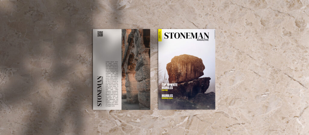
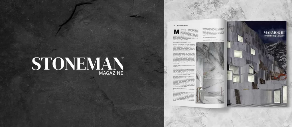
- Magazine Cover Design: Each issue features a bold, visually striking cover that highlights a stone-related masterpiece. The branding elements frame the content beautifully, ensuring a consistent look and feel.
- Digital Presence: The website and social media platforms were designed to reflect the magazine’s aesthetic, with a focus on clean layouts, high-quality imagery, and engaging content.
- Print Collateral: Business cards, letterheads, and promotional materials were created to maintain a professional and cohesive brand image.
Impact and Reception
The rebranding of Stoneman Magazine successfully elevated its market presence, attracting a wider audience and garnering positive feedback from industry professionals. The cohesive visual identity established the magazine as a trusted and authoritative voice in the field of stone artistry and architecture.
Conclusion
The branding of Stoneman Magazine is a testament to the power of thoughtful design. By capturing the essence of stone in a modern and sophisticated manner, the brand stands out as a leader in its niche. This project not only highlights the importance of aligning design with brand values but also demonstrates how a strong visual identity can leave a lasting impact.
